[racket-dev] more space in GUI?
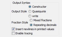
The language chooser details panel looks like the attachment.  It
looks like there are five Output Styles and Fraction Style combined,
rather than two distinct blocks of 3 and 2.  A little spacing might
make it a bit easier to read.
-------------- next part --------------
A non-text attachment was scrubbed...
Name: chooselang.png
Type: image/png
Size: 5895 bytes
Desc: not available
URL: <http://lists.racket-lang.org/dev/archive/attachments/20100827/f10a4a86/attachment.png>